 |
(Photo: Bobby Doherty/New York Magazine) |
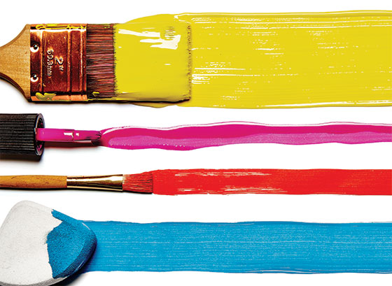
Picking out a paint color�for the living room, for a self-portrait, for your toes�can often involve hours of deliberation and the occasional hardware-store panic attack: Are the yellow undertones of that matte white too sickly? Will that gray oil paint come across too warm? Is that the right red nail polish for my skin tone? Just in time for summer renovation projects and Prospect Park watercoloring field trips, we gathered together the city’s various experts on all things hyperpigmented and asked them to pick out�and muse on�their favorite hues. The result: More than a dozen local interior designers go deep into their preferred whites and neutrals, calming greens, and Hermès-�cashmere-sweater-reminiscent oranges; 15 well-known New York artists famous for their paint-�obsessiveness reveal their most treasured cobalt pigment sticks and �baby skin��colored spray paint; while Billy the Mime picks out the best acrylic white face paint for doing Thomas �Jefferson and Jeffrey Dahmer impressions.
Category I: Décor
Interior designers offer up that one color they can’t interior-design without.
By Jason Chen
 |
(Photo: Bobby Doherty/New York Magazine) |
From left:
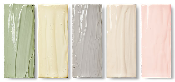
Antonino Buzzetta on Benjamin Moore’s Regal Select: Slate Teal, Pearl
�Slate is the Goldilocks of teal: Most teals tend to be too green or too blue. It has this neutrality that works so nicely with blacks and grays, which is what I paired it with when I used it for an accent wall in a bedroom I just designed.� $53 per gallon; H. Brickman & Sons, multiple locations.
Jon Call (Mr. Call Designs) on C2’s Luxe Interior: Summer Squash, Eggshell
�I love what it does to a sunny living room�light activates the pigments and brings a happy glow to the space. I’ll pair it with soft whites or camels; the �combination feels soft and elegant, like a stack of cashmere sweaters at Hermès.� $75 per gallon; Colours by Martin, 191 Ninth Ave.
Sam Allen on Donald Kaufman’s DKC-66, High Gloss
�This aubergine is very �dramatic, especially when used with brass hardware in a study or bar. What helps it flatter a room are the green undertones�which is nature’s enhancer�rather than blue. Don’t use it in a kitchen or bathroom�too intense.� Price upon request; Colours by Martin.
Roman Alonso (Commune) on Fine Paints of Europe’s Signature Collection: No. 9340, Eurolux Gloss
�This is an almost-ancient-looking red that the eye never really gets sick of. It’s great for wood-grain walls and doors�it’d be stunning to paint some wood dark green, cover it with Cottage Red, and wait for it to chip.� $139 for 2.5 liters; Janovic Plaza, multiple locations.
Patrick Mele on Benjamin Moore’s Aura Interior: Yolk, Matte
�It’s almost cringe-�inducing�in a good way. And an exclamation point where other yellows can be dull. I used it on a home where the hallways were covered in blue-and-white wallpaper, and gave the alcove some pop of Yolk.� $70 per �gallon; M. Schames & Son, 90 Delancey St.
 |
(Photo: Bobby Doherty/New York Magazine) |
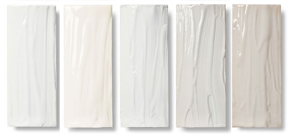
Gray Davis (Meyer Davis) on Fine Paints of Europe’s Natural Color System: S2020-G50Y, Eurolux Gloss
�This shade is visual peace, and it’s not trendy. I used it in my upstate house�on every interior door and all the bathroom vanities�to create this lovely calming through line.� $139 for 2.5 liters; Colours by Martin.
Mara Miller (Carrier & Company) on Farrow & Ball’s Estate Emulson: Pale Hound No. 71, Flat
�Yellow can so often read mod and poppy, like a lemon meringue�and even a pale yellow can be too voluble or veer into nursery-room sweet, but this has a beigeness that’s so sophisticated.� $97 per �gallon; Farrow & Ball, 32 E. 22nd St.
Ryan Korban on Fine Paints of Europe’s British Standard: Minerva Gray, Eurolux Flat
�Clients get nervous and think it’ll be dark, but it isn’t�this has the richness of a dark gray while still being neutral. I just used it in my living room; I left the moldings white, but the rest I did in Minerva.� $85 for 2.5 liters; Janovic Plaza.
Sara Story on Pratt & Lambert’s Accolade Interior: Flax, Matte
�Flax has a really soft earth tone to it�just soft enough that, compared to blah beige-browns, it’s still modern. I recently used it in the living room of a townhouse on the Upper West Side with a blackened steel mantel and quartzite stone.� $69 per gallon; Nuthouse Hardware, 202 E. 29th St.
Kelly Wearstler on Pratt & Lambert’s Accolade Interior: Coy Pink, Eggshell
�Coy takes on distinct hues in different lighting, so the room changes throughout the day. And it’s flattering next to every complexion. I love it for a powder room. Don’t use it in a closet; clothing can reflect the paint and take on different hues.� $69 per gallon; �Nuthouse Hardware.
 |
(Photo: Bobby Doherty/New York Magazine) |
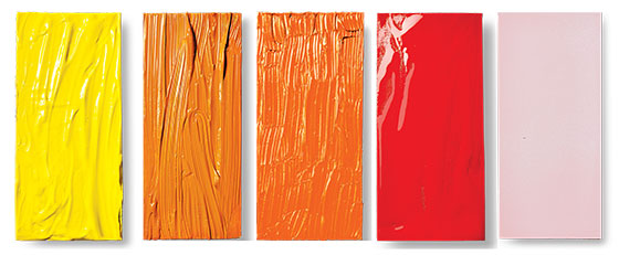
Will Saks (Homepolish) on Benjamin Moore’s Aura Interior: Decorators White, Matte
�Because of the gray undertones, it’s a much more �versatile white than creamier ones that can make people look sickly. I used it for an apartment that had great art�it’s super-�neutral, so I never worry about clashing colors.� $70 per gallon; Tribeca Paint, 217 W. Broadway.
Joshua Greene (Hernandez Greene) on Ralph Lauren’s Interior: Pocket Watch White, Eggshell
�This white is not too creamy and not too stark. We particularly like it for crown moldings. It’d be gorgeous, too, as a contemporary transformation of, say, a Louis XVI settee or a crib.� $38 per gallon; Saifee Hardware & �Garden, 114 First Ave.
Will Cooper (ASH NYC) on Pure & Original’s Classico Chalk: Silk White, Matte
�I love that it’s very powdery and really shows the strokes of the brush for that hand-applied finish. There’s also more pigment used here in proportion to the solvents and additives, so it’s a richer, deeper white that feels very refined.� $93 for 2.5 liters at nordshape.co.uk.
Ryan White on Portola Paints’s Acrylic: Northern Lights, Flat
�I’ll use this in a hallway to give it a real sense of openness�it’s a crisp white with a hint of gray, which helps to create a sense of mood rather than just clinical blankness, which can happen with a lot of whites. On furniture, too, it could add a note of depth.� $58 per �gallon; portolapaints.com.
Palmer Thompson-Moss on Farrow & Ball’s Estate Emulsion: Shaded White, Matte
�It looks totally different depending on the light. I prefer it in a bedroom or living room with lots of light because it really enhances shadow. I used it on a stairwell and ceiling by a skylight; it had this warmth and elegance that brighter whites don’t have.� $97 per gallon; Farrow & Ball.
Category II: Art
Painters rhapsodize on the single color that’s currently speaking to them.
By Dawn Chan
 |
(Photo: Bobby Doherty/New York Magazine) |
Natalie Frank on Turner Design’s Gouache: Permanent Lemon
�Gouache, an opaque watercolor, simulates the heft and illusionistic possibility of oil paint. I started using the yellow a few years ago with chalk pastel for my drawings, layering one on top of the other.� $8 for 25 ml.; New York Central Art �Supply, 62 Third Ave.
Peter Saul on Golden Artist Colors’s Acrylic: Indian Yellow Hue
�It makes everything �yellowish without changing the shapes in any other way. This reminds me of the movies and color photography, and every other �glamorous thing there is.� $21 for 8 oz.; New York �Central Art Supply.
Alex Katz on Rembrandt’s Artists’ Oil Paint: Cadmium Orange
�My early works were done with Bocour paints, and when they were discontinued, Rembrandt was suggested to me. I like its pitch and the consistency. Right now I’m using a lot of �cadmium orange.� $25 for 40 ml.; Utrecht Art �Supplies, 148 Lafayette St.
Angel Otero on Guerra’s Pigment: Cadmium Red Light Xtra
�Recently, I’ve been using this raw red pigment, adding it to photos, which I then press against the canvas to create my silicone transfer works and monotype prints. This red is an especially vibrant one.� $98 for 16 oz.; Guerra Paint & Pigment, 510 E. 13th St.
Mika Tajima on Montana Gold’s Acrylic Spray Paint: Baby Skin
�Spray paint is resonant for me because it takes on both abstract and concrete forms. This color changes with what it’s in relation to�it can be seen as fresh life or the luminescent fog of a chemical lab.� $8 for 400 ml.; jerrysartarama.com.
 |
(Photo: Bobby Doherty/New York Magazine) |
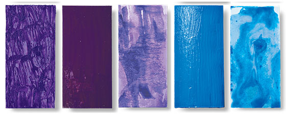
Amy Sillman on R&F’s Pigment Stick: Cobalt Violet Deep
�I can’t live without these wax sticks: It’s a relationship somewhere between drugs and baked goods. The cobalt-violet is a beautiful, fugitive, see-through violet, like a skein of silk.� $78 for 188 ml.; New York Central Art Supply.
Marilyn Minter on One Shot’s Lettering Enamels: Proper Purple
�Enamel paint’s translucency and richness give my paintings their look. This is our most �important color because it’s so flexible: I’ll tint it with yellow for a rich brown or add green to get it nice and muddy.� $14 for 4 oz.; Utrecht Art Supplies.
Mathew Cerletty on Sennelier’s L’Aquarelle:Dioxazine Purple
�I started using watercolor as a counterpoint to my more technical oil paintings. I like purple because it’s beautiful and slightly suggestive. It’s funny how purple elicits passion from certain �creative’ personalities.� $11 for 10 ml.; New York Central Art Supply.
Joanne Greenbaum on Lefranc & Bourgeois’s Flashe Vinyl Paint: Cobalt-Blue Hue
�I use Flashe for its matte surface and ability to absorb light. This blue is especially nice because the consistency of the color conveys simple blueness and has a particular generic feel I enjoy playing with.� $10 for 125 ml.; New York Central Art Supply.
Spencer Finch on Winsor & Newton’s Professional Watercolor Tubes: Cobalt Blue
�I paint with this a lot, mostly for sky and water, and sometimes for painting my own eye. It is my best friend in the paintbox; it feels like a natural pigment, like it is from the world, not from a laboratory.� $10 for 5 ml.; Dick Blick Art �Materials, 237 W. 23rd St.
 |
(Photo: Bobby Doherty/New York Magazine) |
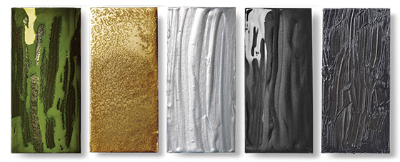
Carroll Dunham on Guerra’s Pigment Dispersion: Nickel Azo
�This pigment is related to green and brown while being neither. It’s actually a rather disgusting color, reminiscent of dirt or bodily functions. But it also has an industrial purity that makes it beautiful in its way.� $24 for 4 oz.; Guerra Paint & Pigment.
Rashid Johnson on Rust-Oleum’s Metallic Specialty Spray: Brass
�When I was a kid, my mother bronzed my baby shoes. That golden-bronze color of the shoes has always stuck with me. For me, that bronze is a vehicle for cementing memory and nostalgia.� $11 for 11 oz. at amazon.com.
Rico Gatson on Golden Artist Colors’s Acrylic: Iridescent Silver (Fine)
�I started working with a four-color combination a few years ago�red, yellow, green, and orange�and decided to add iridescent silver, which gives a futuristic feeling to the equation.� $6 for 1 oz.; Utrecht Art Supplies.
Keltie Ferris on Guerra’s Graphite Pigment
�Graphite is such an elemental pigment; we all learned to write with pencils. I love the iridescence of the near black and the dark grays it produces. When mixed with linseed oil, it can appear dark black; from other views, it’s a paler gray.� $6 for 2 oz.; Guerra Paint and Pigment.
David Salle on Old Holland’s Classic Oil: Scheveningen Warm Gray
�I use this gray to make shadowed skin tones. It’s warm and buttery, but not too warm. I like what the gray does next to a bright Naples yellow.� $14 for 40 ml.; Soho Art �Materials, 7 Wooster St.
Category III: Body
Nail pros and mermaids open up their makeup bags.
By Kathleen Hou
 |
(Photo: Bobby Doherty/New York Magazine) |
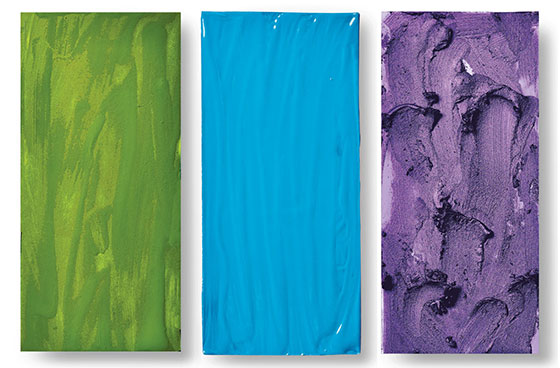
Juliet Jeske �(Children’s Face Painter) on Wolfe Face Art & FX’s Hydrocolor Essential: Green
�Other kids’ face paints you can see through, but Wolfe’s set is more opaque. And if the kids touch it, it won’t smear. Boys always ask for Teenage Mutant Ninja Turtles; I use this Kelly green as a base, then contour with a forest green.� $14; Abracadabra, 19 W. 21st St.
Angelina Avallone (Makeup Designer) on M.A.C’s Acrylic Paint: Hi-Def Cyan
�I used these paint pots on a film I did recently�they’re blendable, and they won’t sweat off. They’re fun as body paint, too. The Cyan is a happy, retro blue, and you can mix it with white to create a Smurf or dark blue for an Avatar.� $20; M.A.C Pro, 7 W. 22nd St.
Linden Wolbert (Professional Mermaid) on Maybelline’s Eye Studio Color Tattoo Cream Gel Eye Shadow: Painted Purple
�It stays put on my lids, even in superhot weather, humid, tropical conditions, and most importantly, underwater. I tell kids, �It’s spe-shell mermaid makeup made with a touch of octopus ink!’ That always gets a giggle.� $5; target.com.
 |
(Photo: Bobby Doherty/New York Magazine) |
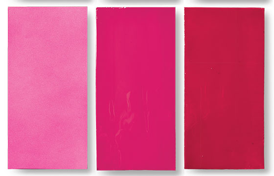
George Kyriakos (Stylebookings.com Founder) on Rita Hazan New York’s POP Color Temporary Color Spray: Pink
�I’ll use this hair paint on a client who wants to experiment with a punk look for a party. It’s a vibrant pink that covers really well. It works best on blondes; so brunettes might be better with the blue.� $18; Rita Hazan Salon, 720 Fifth Ave.
Nadine Abramcyk (Tenoverten Owner) on NARS’s Nail Polish: Schiap
�A perfect warm-weather pink. It has an electric tint, so it’s not too girlie�and the undertones are not too warm, not too cool. In the early days of Tenoverten, I was constantly recommending it, so there’s a mini-group of devotees that has developed and stayed loyal.� $20; sephora.com.
Eleanor Langston (Paintbox Owner) on Smith & Cult’s Nail Polish: Kundalini Hustle
�This classic fire-engine red has blue undertones that make it work year-round, as opposed to more Bordeaux reds that are too deep for the warm weather. And I love how opaque the formula is�two coats give you a great saturated effect.� $18; net-a-porter.com.
 |
(Photo: Bobby Doherty/New York Magazine) |
Lady Bunny (Drag Artist) on Obsessive Compulsive’s Lip Tar: Matte, Beta-True Orange
�I’ll use this almost every time I drag up. You can buy regular orange lipstick, but the color is often muted. I’ll sometimes add some �yellow in the middle for extra zing. Plus, the brand is vegan and pleasantly scented with peppermint oil.� $18; occmakeup.com.
Rebecca Perkins (Rouge NY Founder) on Temptu’s Airbrush Airpod System: Porcelain
�When I did makeup for Law & Order: SVU, I used this foundation to turn actors into corpses. Porcelain has a bluer undertone to it. With corpses onscreen, you want to cast a blue-gray tinge to take away any living-looking warmth.� $50; Temptu Pro, 26 W. 17th St.
Billy the Mime (Professional Mime) on Mehron’s Face Paint: Starblend Pancake
�It’s not so thick that it masks your face: I need to show the nuance of Jeffrey Dahmer’s hunger or Thomas Jefferson’s leer. I apply it with a wet sponge, and use a sock filled with baby powder to set it.� $10; Alcone Uptown, 322 W. 49th St.
The Right Hue
Eve Ashcraft, owner of the eponymous color-consultation firm, on how to arrive at the best shade for the breakfast nook.
 |
(Photo: Bobby Doherty/New York Magazine) |
 |
Illustration by Joe McKendry
|
Actually live with that Summer Squash first. �If I could convince people of just one thing, it would be to buy a small sample of two or three paints and paint a segment of your wall�then live with them for a bit. The biggest mistake people make is buying paint for a whole room based on a paint chip. I can’t tell you how many people call me in tears saying that the pale yellow on the chip looks insane on the entire room.�
Consider the lightbulbs. �Obviously, the more light there is in the room, the brighter your colors will look, but know also that if you’re going to be using the room a lot at night (a bedroom, say, or a study), you should understand and test how the walls will look in that context. Are you using fixtures that throw light in funny angles? Are you using fluorescent bulbs (which can be cooler and more commercial feeling) or incandescents?�
Forget color theory. �People always ask about the supposed effect of colors (�Is pink really calming?’), but no matter how scientifically we’ve come to deciding that one color does this or that, you’ll find someone else who doesn’t feel that way at all. Choose what makes you feel good.�
The Brushes to Use
For the area around the door and window frames:
Three-Inch Purdy XL Blue Heron BT
$16.50; thepaintstore.com
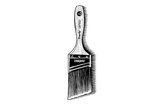 |
Illustration by Joe McKendry
|
The angled bristles let you paint in straight lines against trim and moldings; the beavertail-style handle provides the most comfortable grip too. (As much precision as this brush gives you, don’t skip the tape.)
For walls and ceilings:
Whizz Six-Inch Polyamide Rollers With Handle
$7; thepaintstore.com
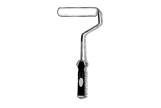 |
Illustration by Joe McKendry
|
Leaves a textured �semi-smoothness without foam residue that cheaper rollers can release, and the handles have covered ends that help reach corners.
For irregular surfaces and detailed furniture work:
Proform Picasso Oval Angled Brush 1.5-Inch
$7; thepaintstore.com
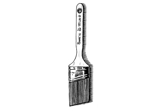 |
Illustration by Joe McKendry
|
Made of an easy-to-clean filament-brush blend, this durable toucher-upper (the patented interior construction binds the metal ferrule to the wooden handle in a way that never loosens) enables the most meticulous fill-ins.
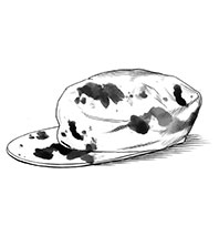 |
Illustration by Joe McKendry
|
Or Hire Someone to Use Them for You.
The pros on their go-to wall painters
$: Paintzen, paintzen.com; about $.75 per square foot.
�This company takes care of everything for you. They’ll give you an estimate�they can even do it remotely based on dimensions and the scope�actually purchase the paint, and paint for you. Their painters will even do minor patching and prep before they start.� �Will Saks
$$: Silva European Painters, 914-376-5546; about $2.50 per square foot.
�Jorge Silva is the easiest �can do’ guy I’ve ever worked with�I’ve been using him for ten years. Once he took a beaten-up cream exterior in Greenwich and had the whole thing�trim, �windows, and all�painted a custom charcoal gray in under two weeks, just in time for my client’s homecoming party.� �Patrick Mele
$$$: R&S Painting Corp., 347-366-1238; about $4 per square foot.
�Sal Martinez does an exquisite paint job and also Venetian plasters and wallpapering. And honestly, for his quality and skill level, the pricing is actually quite reasonable. Last year he took on two projects for us at the same time�not only did he complete both on deadline, but he did it all beautifully.� —Mara Miller
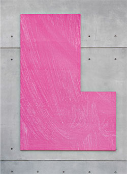 |
Detail of Sunset (Whitney Museum of American Art, New York, May 1, 2015).
(Photo: Marco Anelli/Courtesy of the Whitney Museum of American Art) |
Artist Mary Heilmann Paints Her �
Canvases: Pink
�For my new exhibit at the Whitney, I was thinking about these pink and black paintings I had done in the ’70s and ’80s; back then, that pink came from pop culture�Pretty in Pink, club lights. Now, I’m struck by the way the sunset turns the water pink. With this painting, I took two-thirds Liquitex Fluorescent Pink acrylic paint and added one-third �Liquitex Iridescent Medium, with a little water thrown in to create a thin neon pink, so that the brushstrokes really showed. I painted it in a gestural way, almost like Asian calligraphy, and I kept sweeping it across the canvas. All of a sudden, it was just perfect�that moment is like coming to the top of the Himalayas, it’s fabulous.�
Toenails: Red
�Revlon’s colors inspire mine. Way back when I was a kid in the ’50s, there was a Revlon ad with a model showing her fingernails painted with Fire and Ice, which was this cadmium red that I loved. I used that red in my painting Fire and Ice, and we got some of the polish from Revlon too, so I painted my toenails that color�I love it.�
Kitchen: Mint Green
�When I moved in to my Bridgehampton house, there was some wainscoting on the kitchen walls in a very pale mint green. When they made those first tract houses in Levittown, which were a childhood influence of mine, they painted all the exteriors different colors, and that mint green was one of them. So when I painted the rest of the house, I left the mint green in the kitchen and in the bathroom too.�
—As told to Monica Kim
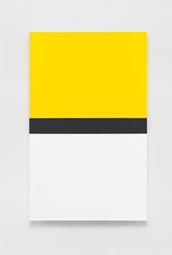 |
Yellow With Black and White, 2013.
(Photo: Ellsworth Kelly/Courtesy of Matthew Marks Gallery) |
Ellsworth Kelly Explains How He Finds That Perfect Yellow
�In my recent show at Matthew Marks Gallery, there are five paintings that use the color yellow, and each one is slightly different. There are hundreds of yellows, but I’m looking for one that my eye says works for that particular painting. For me, the process of making a painting is very private. I paint on stretched canvas that is prepared with gesso and then painted with oils. I get to a color by instinct; I mix color according to my eye. I never use exactly the same color because I don’t mix scientifically; I use intuition, so it’s impossible to make exactly the same color again.�