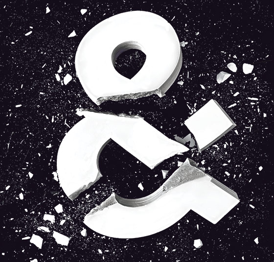
Jonathan Hoefler is standing in his office on the seventh floor of the Cable Building in Noho, sipping a mug of ginger tea and telling stories about an obscure 16th-century Flemish punch cutter. His people are getting bored and wandering away to check their phones, the people he has brought here today to make sure he doesn’t say anything that will harm him in the ongoing court battle that has torn apart and reconfigured this famous type-design firm. But Hoefler doesn’t seem to care. He’s grinning through the gap in his top teeth.
Hoefler picks up an antique type-specimen book and flips through page after page of the punch cutter’s alphabets, explaining why the letterforms are so lovely to him. “I think it’s kind of the gentle taper of these serifs,” he says, running his hand reverently across a page of type. “It gives it a kind of intellectual quality.” This punch cutter’s name was Hendrik van den Keere, and Hoefler points to a series of small geometric shapes that dangle like Christmas-tree ornaments from the interiors of some of van den Keere’s letters. Then he turns the page and points to a lowercase a. See? he says. It doesn’t have the usual “ball terminal” at the upper left. Hoefler looks up. “I think that kind of controlled irregularity is what van den Keere was about.”
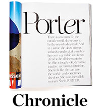
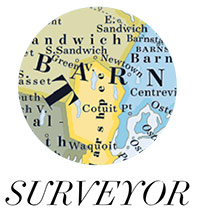
The 18-person type foundry he runs, Hoefler & Co., is in the process of making an original font family based on a van den Keere alphabet, one of several projects the company is working on. On a tour of the office, Hoefler introduces designers in white cubicles, tweaking typefaces on Macs. One is immersed in customizing a version of Chronicle [ fig. 1 ] commissioned by the online retailer Net-a-Porter. Another designer is at work on a display face that’s part of a larger font family called Surveyor [ fig. 2 ], inspired by lettering on old maps. He grabs a piece of paper and holds it up. PHYLLIIDAE, it says. FA’A’A, OODAAQ, & TRÆÆSKE. Nonsense phrases to test certain letter combinations. He points to a line of six potential E’s, each slightly different. “All of these are kind of plausible at this point,” he says, frowning, “but still not intellectually satisfying.”
After the tour, Hoefler brings me to a conference room with wall-to-wall bookcases, weathered spines of rare type books stretching to the ceiling. In addition to his lawyer and a public-relations representative from the Ketchum firm, he’s joined by his wife, Carleen Borsella. Borsella has worked alongside Hoefler on marketing since 2002, and Hoefler mentions her often as he lays out the big picture of how the company functions and what they see coming: their collaborative, agile workflow system; their recent entry into the web-font business; their belief in mobile-first development, the idea that products should be designed to work on smartphones first. It’s all very future-oriented, which is telling, because the past has recently become an issue at Hoefler & Co. The past is tied up with a designer who helped build this place. He brought in money and prestige, but more than that, he used his skill and position to elevate type in the pop-cultural consciousness, to transform type designers into a new class of conquering nerd. Until a few months ago, his name was on the door. He labored here for 15 years in the belief that he was an equal partner with Hoefler, only to find out last year, in a stunning and terrible moment, that Hoefler didn’t see it that way.
That partner, the designer Tobias Frere-Jones, is having trouble getting the words out. Sitting in a conference room at the law firm now representing him—Hoguet Newman Regal & Kenney LLP, on the 35th floor of a midtown high-rise—he pauses a lot, retraces his steps, begins his sentences again. His lawyer is here; so is his wife, for support. He’s suing Hoefler for “not less than $20 million” in New York Supreme Court, alleging that Hoefler committed “the most profound treachery and sustained exploitation of friendship, trust and confidence.” Frere-Jones says that in 1999, Hoefler made a verbal offer to make him a 50-50 partner, and that this offer is legally binding, even though Hoefler never wrote it down. He says Hoefler exploited his talents and his intellectual property for years before ultimately refusing to put their agreement on paper, essentially telling him to fuck off.
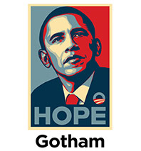
Frere-Jones looks like a young art-school professor, which he is, at Yale: thin, compact, striped shirt, vest, thick glasses. He isn’t as smooth or confident as Hoefler. When he starts talking about how he first became interested in type, he sputters for a few seconds, then says, “I could tell a very long version of that story, which I’ll spare you.” According to a designer who used to work with Frere-Jones, his eye is so sharp that he can look at a printout of a letterform and tell if it’s one pixel off, the same way Ted Williams was said to be able to hold a baseball bat and tell if it was a half-ounce too heavy. He often approaches type design from strange and playful angles; in college, he drew an experimental font called Cat’s Cradle, “which nested and tangled each letter into its neighbor, like shopping carts nested together in front of a supermarket,” he says. “The goal was to preserve character identity under duress.” Some of the most popular and versatile fonts of the past two decades are Frere-Jones creations, including Gotham, the font that Barack Obama used to project his ideas and values to the world in 2008—Shepard Fairey’s famous HOPE poster [ fig. 3 ] is in Gotham, too—and also the font chosen by the 9/11 Memorial designers when they carved a remembrance into the granite cornerstone of the Freedom Tower.
Frere-Jones grew up in Brooklyn, in a family of writers who revered books; his father wrote for advertising agencies, and his older brother, Sasha, would become a music critic. He used to follow his father to work on weekends, combing through offices vacated by people who had left the company “for free art supplies,” he recalls. “My first type-specimen book was rescued from a trash bin on one of these weekend visits.” The idea that there were such things as “typeface designers,” people whose job was to draw letters, struck Frere-Jones with great force: Designing alphabets, he’d later say, seemed like “designing water or designing air.”
He went to the Rhode Island School of Design and started drawing typefaces. Soon a professor introduced him to Matthew Carter, perhaps the preeminent living type designer, and by age 20, Frere-Jones had published his first commercial font, a funky design he’d sketched on a napkin (for a band his brother was in).
Frere-Jones is so prominent now—“one of the two or three best type designers in the world,” according to Erik Spiekermann, a German type master—that it’s easy to assume his success was inevitable. But he probably owes some part of it to auspicious timing. He happened to be entering the field at the dawn of a type revolution. It used to be that there were just 2,000 or 3,000 fonts in the world, pieces of actual metal, and only designers knew their names. The personal computer was changing all that. Now anyone could type a document in Palatino or Times New Roman or Helvetica. People suddenly had relationships with fonts. And because it was so much easier to create and market a purely digital font than a physical one, individual designers or small groups could sell fonts of their own. A new generation was about to make its name.
Type is a derivative form. A designer starts not with a blank canvas but with a set of rules for creating letters and the knowledge that thousands of others have interpreted the rules stretching all the way back to Gutenberg. Even by his early 20s, Frere-Jones knew enough about type history to avoid repetition and create shapes that seemed contemporary. He also had a monastic sort of patience. He could sit in his office and tweak the thousands of small details required to bring a high-end font family to completion: the endless “kerning pairs” that determine the spacing between letters; the multiple weights and widths of a font that allow designers to make words lighter or darker or narrower or wider as they please; and the cooperation of all the shapes with each other—the lowercase and the uppercase, the light and the bold, the roman and the italic—so that anyone using or reading the font will experience “a sense of balance and organization on multiple levels,” he says. “It’s like trying to conduct an orchestra with, I don’t know, 500 people in it.”
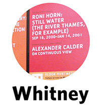
In Boston, working for a company called Font Bureau, Frere-Jones racked up a number of successes, including Whitney [ fig. 4 ], a sans-serif font that made magazine infographics look more modern, and Interstate, a display typeface inspired by American highway signage. He liked his job, but after several years, it started to bother him that he was designing fonts for other people instead of for his own company. But he knew a guy who didn’t have that problem, and because the type world is small, they started talking about it together.
In some ways, Jonathan Hoefler was a lot like Frere-Jones. They’d both grown up in New York, and they’d both fixated on type at a young age. But Hoefler had chosen a different, more entrepreneurial path forward. He’d gotten his start at 17, clocking hours at a service bureau in Manhattan, the kind of place where people would bring files on floppy disks to have them typeset by professionals; laser printers weren’t yet affordable. There he met Roger Black, a prolific magazine designer (Esquire, Rolling Stone, The New York Times Magazine), and the following year, 18-year-old Hoefler started hanging around Black’s studio. “Like a lot of smart kids, he was sometimes insufferable, but other times adorable,” Black remembers. After learning that Black was fond of an archaic font called Egiziano, young Hoefler created a version of Egiziano just for Black, as a gift. “It was beautifully done,” Black says. “Very ingratiating. And I actually used it.”
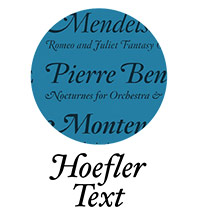
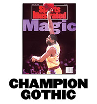
Unlike Frere-Jones, Hoefler never set out to become a type designer specifically. What excited him about type was what you could make with it, what you could say: “It wasn’t just the typeface, it was the complete communication.” But because electronic publishing was still new, most digital fonts then were of poor quality, so he had to make his own. Art directors kept asking him where he was getting these great fonts, so in 1989, he hung a shingle as the Hoefler Type Foundry and started drawing alphabets for money. He remembers Sports Illustrated calling him: “Let’s do a typeface that feels masculine but doesn’t undermine that this magazine is about journalism. It works for Michael Jordan, but also for the Ukrainian gymnast who breaks her ankle the week before the Olympics [ fig. 5 ].” He also drew a font for Apple he called Hoefler Text [ fig. 6 ], which became standard on every Mac.
Because Hoefler and Frere-Jones were both avid collectors of rare type books and regularly bid for the same volumes, they often crossed paths. Every year or so, Hoefler and Frere-Jones would grab a meal and talk about how great it would be if they worked together. According to Frere-Jones, in 1999, Hoefler asked him to dinner at the Gotham Bar and Grill and proposed a 50-50 partnership called Tobias and Jonathan’s Excellent Adventure LLC. They’d get more business together than they would alone; their talents would complement each other. According to Frere-Jones, the deal was basically this: Frere-Jones would make the fonts, and Hoefler would use his client-hustling skills to sell them. (Hoefler, in legal papers, denies that this oral agreement ever existed.)
Frere-Jones moved to New York and brought his rare type books with him. He also agreed to bring 11 fonts to the company, a good chunk of his Boston output. He and Hoefler called these the Dowry Fonts “because this was going to be like a marriage,” Frere-Jones says.
Although he says now that the fonts were worth more than $3 million, he signed an agreement that transferred them to the Hoefler Type Foundry for a sale price of $10. The agreement also spelled out that he and Hoefler were “independent entities,” not partners. Frere-Jones didn’t consult a lawyer; he says he gave the fonts away for $10 because “I was giving them to my own company,” and he signed the agreement about being an independent entity because he was just trying to keep things moving. Unfortunately for Frere-Jones, Hoefler is now using that agreement and Frere-Jones’s employment contract to contend that Frere-Jones was always an employee, not a partner, even though Hoefler’s own statements give a different picture of the arrangement. For instance, in an email to an advertising agency in 2002, Hoefler wrote, “Since 1999, Tobias has been a partner at The Hoefler Type Foundry.” And here’s Hoefler writing to Frere-Jones about a brainstorm related to an exhibit of type-specimen books: “It’s possible that your partner is a genius.”
After Frere-Jones sold his fonts, Hoefler renamed the company. It was now Hoefler & Frere-Jones, H&FJ for short. They drew an elaborate custom ampersand and etched it above the door between their names.

It didn’t take long for news of their collaboration to spread. In February 2000, the new creative director of George emailed Hoefler asking for “a new body font plus a sans serif display family … Any thoughts?” Hoefler replied that he was booked solid for the next two months because “my new (and still as-yet-unannounced) partnership with Tobias Frere-Jones has opened the floodgates for new work.”
This was the year Frere-Jones started to draw what would become his best-known creation, in response to a request from GQ. GQ wanted a geometric sans-serif. Frere-Jones looked to the signage of New York for inspiration, particularly the letters that spelled out PORT AUTHORITY above the entrance to the Eighth Avenue bus terminal. He spent his weekends roaming Manhattan with a camera, photographing signs on buildings to get ideas for numerals, lowercase letters, and italics [ fig.
7 ].
At his computer, he drew an uppercase H, O, and D, because they contained flat and round elements that would determine how other letters looked. When he moved on to the G, the R, and the S, he started to deviate from the mathematical grid, hoping to give the font a subliminal playfulness. As he filled out the alphabet, the letters revealed a promising flexibility; if Frere-Jones set text in caps and spread the spacing out, the words felt authoritarian, imposing, and if he set them in lowercase and pulled the spacing in, they felt fresh and young. He tried to think of a name for the font that would showcase some of the more distinctive letters: the stark, powerful G; the circular o; the strange-tasting a. For a name, he thought about Goats, and Gomorrah. He finally settled on Gotham.
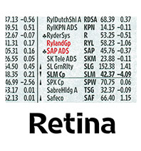
At the very beginning, recalls Frere-Jones, the company was just Hoefler, him, and a third person answering the phones, sitting together in one room. He and Hoefler “more or less lived at the office,” Frere-Jones says. “We were both throwing everything we could at making it succeed.” Frere-Jones worked on Gotham but not exclusively. Another early project was Retina [ fig. 8 ], commissioned by The Wall Street Journal for its stock listings. Because it had to be legible at very small sizes, Frere-Jones removed parts of Retina’s letterforms at strategic joints so that when the letters bled onto the newsprint, they filled themselves in. According to Journal senior designer David Pybas, Retina allowed the paper to print the same amount of information on eight fewer pages every issue, saving about $6 million to $7 million a year in printing costs.
Hoefler and Frere-Jones “spent a lot of time discussing projects and just hanging out,” says Jesse Ragan, a type designer who worked at the company between 2001 and 2005. “Definitely they had their own typefaces, their own babies, their own creations, but they would get feedback from each other.” In 2002, when they moved to a new office in the Cable Building, they combined their personal collections of type books into a majestic double-sided set of bookcases. Says Ragan, “They’d constantly call out references: ‘Oh, this could be more of a Clarendon a, or a Bodoni a.’ They would pull books down from the library and say, ‘No, this is more what I mean, something more like this, something that has this personality.’ ” From time to time they’d take a break to play a first-person-shooter video game called Marathon, blasting each other to bits over the network. One afternoon, Hoefler sent Frere-Jones an email: “are you around later for a game of Immolate-Your-Business-Partner?” Frere-Jones replied, “YES.”
As far as clients could tell, the two men were “joined at the hip,” says Alexander Isley, a creative director who commissioned fonts from them. “They were seamlessly collaborative. I feel I could pick up the phone and speak with either of them, and [the other] would know about it.”
But as the company grew, from five employees to ten to 15, each man carved out his own domain. Today, the exact division of labor has become an issue. “I’ve been drawing type for 25 years,” Hoefler says. “I work with the designers here to make type every day. And whether I am making something myself or overseeing it as somebody’s editor, I am responsible for the look, feel, and performance of every character that goes out of this office, and that’s always been the case.” However, according to Frere-Jones and multiple former H&FJ employees, Hoefler left the vast majority of the type-design work to Frere-Jones, who ran the type department from his office way off in the corner. He listened to abstract electronic music and jazz in an enormous pair of headphones that blotted out the noise of Broadway and Houston and crafted a series of hit fonts with his team. Meanwhile, Hoefler and his people did everything else. They pitched clients, negotiated prices, designed the website, designed the type catalogues, wrote the sales copy. The arrangement seems to have been fairly explicit: As Hoefler would put it later, in a brief documentary about H&FJ, “Tobias and his group are more heavily weighted on the ‘making the fonts’ side, and me and my group are on the ‘using the fonts’ side.”
When he had to, Hoefler played hardball. He cared a lot about making sure no one stole H&FJ’s work. A typeface, after all, conceals its authorship. Someone makes a font, puts it out in the world, and if it works perfectly, it’s just letters on a screen, a receding expression of the alphabet. Maybe it means something for people to use Palatino over Times New Roman, but few stop to wonder who drew the letters, who gave the characters their identity.

Frere-Jones was okay with that; unlike Hoefler, he never named a font after himself, the obvious solution to the invisible-authorship problem. “The name is the user’s first point of contact with a typeface, and it should help the user rather than trumpet me,” Frere-Jones says. “I’ve also never felt it necessary to remind people that I designed my typefaces, because everyone already knows it.” Hoefler, however, knew that not everyone did. He would see an H&FJ font on a poster or a billboard or a website and check to see if the company using the font had paid for it; if it hadn’t, he would send a cease-and-desist letter. He once took the unusual step of suing a former employee he alleged had taken H&FJ font designs to a competing company. The employee denied it, and the case settled out of court. (In cases where it seemed like a font had been published that was based on one of H&FJ’s designs, Frere-Jones would do the investigation, “figure out if this was true or not,” he says, “and then I would tell Jonathan what I was able to find, and it would be up to him to decide how to handle it.”)
According to Spiekermann, who knows both Hoefler and Frere-Jones, Frere-Jones is “a cool kid” who “wants to make cool stuff,” whereas Hoefler is “the little nitty-gritty mean little bastard. He is a tight-ass, as we say in German.”
If Frere-Jones saw the business part as drudgery, Hoefler actually found it creatively satisfying. “It’s tempting if you’re a visual artist to think that business is the other stuff,” he says during the January interview at his office. “It’s the dry stuff. It’s paperwork. It’s this guy in a suit”—he points to his lawyer—“and that guy with his phone”—he points to his PR guy. “And it’s not.”
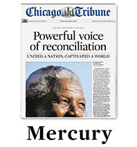
They had some very good years. The best thing that happened to them was undoubtedly Gotham; most type foundries rely on one or two blockbuster sellers to generate the majority of revenue, and Gotham soon became that for H&FJ. They were making a lot of money. But another way to measure their success was in the rising social status of type designers as a class. More and more, design magazines and websites and even art museums were recognizing digital type as a true and important art form, seeking out its leading practitioners—people like Spiekermann in Germany, Zuzana Licko and Rudy VanderLans in Berkeley, and Neville Brody in London—and exalting them as icons. And Hoefler and Frere-Jones probably enjoyed more of this sort of treatment than most. There was something about the union, the partnership, not just one font master but two, like a pop band (later, during the split, design geeks would say it was like the Beatles breaking up), an irresistible concentration of design wisdom and firepower, the two men regularly giving interviews and talks together, racking up prestigious awards. In 2011, the Museum of Modern Art acquired 23 digital typefaces for its permanent collection, including four of H&FJ’s fonts—Gotham, Retina, Mercury [ fig. 9 ], a serif-text font, and HTF Didot. “Type is a design universe unto itself,” a MoMA curator wrote, “an essential dimension in the history of modern art and design.” Hoefler and Frere-Jones were also interviewed and featured prominently in the 2007 documentary Helvetica, about the ubiquitous Swiss-designed font; a lovely exploration of how type can rewire our collective visual consciousness, Helvetica bubbled up from the type-design world into the wider nerd universe and became a surprise festival hit.
By 2011, though, the distinctive personalities of Hoefler and Frere-Jones were generating a slow friction. Jay Moore, an account manager with software-industry experience who worked at H&FJ between 2011 and 2012, describes Hoefler as “pretty intense” and prone to fits of pique. But as much as Hoefler embraced conflict, Frere-Jones avoided it. Moore adds, “Tobias has the capacity to let things go a bit longer, and I think Jonathan has the capacity to harden like steel.” They didn’t spend as many long nights in the office as they used to, in part because both men now had families; Frere-Jones and his wife, Christine, a lawyer from Australia, were caring for a newborn baby, and Hoefler and Borsella would vacation together in France. Borsella was becoming his confidante, taking on a larger role in the company, planning business strategy with Hoefler.
Meanwhile, the terrain of the type business was shifting beneath Hoefler and Frere-Jones. For one thing, it was getting harder to answer the always difficult question of how to place a dollar value on a font—a tiny piece of software, a digital luxury good—in a publishing marketplace frothing with new platforms. How much should it cost to use Gotham in a video game? How much for a magazine’s iPad app? Part of the reason Hoefler hired Moore in 2011 was to negotiate with powerful companies and organizations that might try to get H&FJ’s fonts for cheap. Moore once received a call from the 9/11 Memorial designers. “We picked your font, what do you think of that?” they told him. Moore replied, “Well, did you pay for it?”
Another big change was the increasing competition from young designers looking to break into the font world. “Type designer” was becoming a more popular career choice, partly because Hoefler and Frere-Jones had popularized it. When they were first studying type, back in the ’80s, universities didn’t offer majors in type design. Now there are at least three well-respected schools that crank out trained designers. Hoefler didn’t necessarily need Frere-Jones to train designers anymore; he could outsource that function to the schools.
But if Hoefler believed that Frere-Jones was becoming dispensable, Frere-Jones never caught wind of it. He was too immersed in finishing H&FJ’s web product, cloud.typography, which everyone called “the cloud.” If the cloud worked, it would make H&FJ’s fonts available to a whole new market—web designers—and solidify the future of the company. Starting in 2010, Frere-Jones worked to create 120 special versions of fonts for the cloud, inspecting every glyph in every size across 15 different families. He enjoyed the challenge of solving a problem, but it was also a brutal slog, trying to get the fonts to look good across all web browsers and operating systems. The launch kept getting postponed, and several other companies, including Google, released their own cloud-font services first.
Frere-Jones describes “a sense of crisis” in the office during this time. Says one former employee, “I’ve seen [Hoefler] snap at Tobias in the office, in meetings, which made me very uncomfortable. Also, I was under the impression that they were full partners, so it was really weird seeing that happen.”
Several times over the years, Frere-Jones had asked Hoefler to put their partnership in writing, but there was always some pressing deadline, some crisis that had to be handled, and Frere-Jones let it slide. Early last year, though, he became more insistent, and Hoefler said they’d get to it after they launched the cloud. But when the cloud finally debuted in July, and Frere-Jones brought up the paperwork later that month, Hoefler got angry, according to Frere-Jones’s legal complaint. “Stop it,” Hoefler said. “I’m working on it. Stop harassing me.” When I ask him about the piece of paper Frere-Jones was requesting, Hoefler stiffens: “Piece of paper? What piece of paper? Oh, a new piece of paper that he wanted, you mean.”
Three months later, in October, Frere-Jones again approached Hoefler, who told him to forget it. “Jonathan now had a different idea about what this company was and who I was,” says Frere-Jones. “I was just stunned.” Frere-Jones alleges in his complaint that around this time, Hoefler transferred the shares Frere-Jones believed were his to Borsella. Hoefler says flatly that this isn’t true. “Carleen doesn’t own any part of the company and never has.”
Frere-Jones continued to try to speak to Hoefler until January. He got nowhere. So he walked out the door beneath the big ampersand. “I can’t even describe what it was like to do that,” Frere-Jones says. “To have built this place—” he stops. “To have built my company over 15 years and then just walk out … and close the door behind me.” He stops again. “It had my name on it. And. But. I tried everything else.”
In court papers, Hoefler says Frere-Jones’s suit is “a transparent attempt by Frere-Jones to wrest undeserved equity from a successful designer and businessman that has gainfully employed and generously compensated him for the past 14 years.” Hoefler also argues that Frere-Jones’s salary “increased dramatically during [his] employment.”
At his lawyer’s office, Frere-Jones blinks behind his thick glasses, his voice remaining soft. “I think the design community would disagree about this being undeserved,” he says. “Because they know where the stuff came from.” He ran the type department at a company whose only product was type. He was the auteur responsible for the firm’s auteurish reputation. The pipes for the fonts may have changed, but without him, “all those beautiful pipes would be empty.” He says he hopes to gain custody of the fonts that he drew at H&FJ, including Gotham, and bring them to a new business he’s starting—a one-man type foundry. “I made these, I drew these,” he says. “Everyone in the community knows where these faces came from.”
Hoefler and Frere-Jones don’t seem to miss whatever they used to share (their lawyers would rather they not discuss it anyway). On what drew them together, Hoefler offers: “I can say vaguely that the people I talk to about type are the people who love type in the way that I do, and I think we share a lot of those same values.” All Frere-Jones can muster is “I find it really difficult to go there.” Asked what he has learned from the whole ordeal, he replies, “Ah,” and looks down at his folded hands. “I can’t—shouldn’t—trust appearances.”
Not long before they went to court, they each gave an interview to a film crew with Dress Code, a New York design studio. The resulting six-minute documentary, Font Men, was shown at South by Southwest in March. As Hoefler and Frere-Jones take turns speaking about type, examples of some of their most famous letterforms dance and morph on the screen. There’s talk of inherent trust, of always seeing type in the same light. If a design isn’t working, they both feel it intuitively. It’s a final glimpse of their partnership as something satisfying and fruitful.
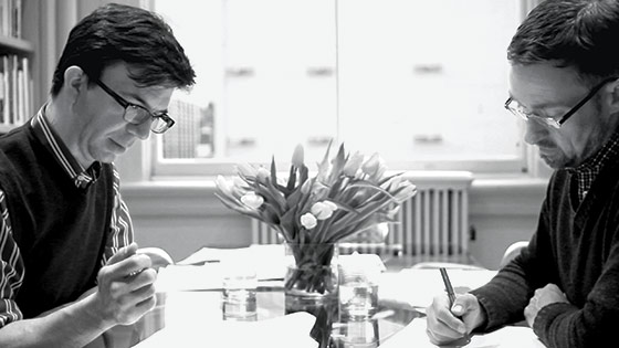
The film is so focused on painting a picture of personal and professional harmony that you hardly notice that there are few scenes of the men actually together. But there is a brief shot in which Hoefler and Frere-Jones are sitting across from each other in the library examining papers near a vase of yellow flowers [ fig. 10 ]. It feels like a window into what their partnership may have looked like in the early days of the company: two ambitious artists surrounded by centuries of bound type history, hunched over their separate projects that invoke and play with that history. One man showing a proof of some letterforms to the other, the other telling him what is or isn’t quite working.
In another scene, Hoefler and Frere-Jones are sitting side by side, facing the interviewer. “There aren’t that many people I’ve met whose opinions I value as much as Tobias’s,” Hoefler says. “We do have a long-standing disagreement on the height of the lowercase t.” Hoefler shoots Frere-Jones a look of mock severity, then breaks out laughing. Frere-Jones nods, looks at the ceiling, and says, “Oh, okay, all right, yeah, there’s a thing with the lowercase t.”
This article has been updated throughout to clarify the difference between typography and type design.