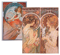
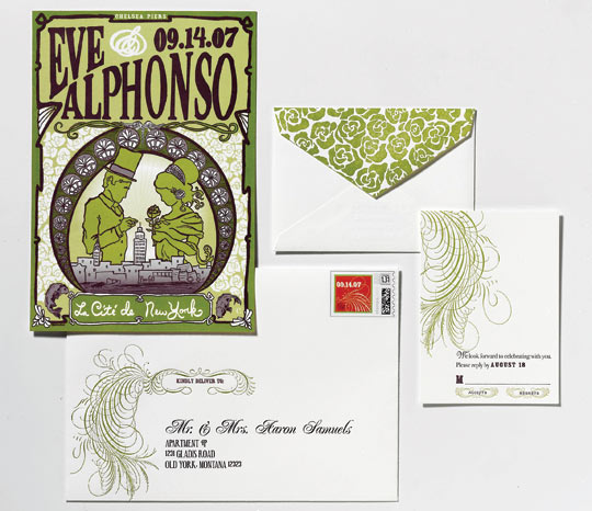
1. Eve and Alphonso brought Art Nouveau posters to our initial meeting. Later we found some period drawings. They also wanted to incorporate elements specific to them—Alphonso’s in medicine and Eve’s a ceramicist, so we included the caduceus (a winged staff entwined with two snakes) for him, and a loose, arts-and-crafts feel to reflect Eve’s lifestyle. They wanted to illustrate that they were getting married at Chelsea Piers, too.”
2. “For the invitation, Eve loved the idea of creating a commemorative ‘poster’—something their guests could keep that was specific to them. We sketched two possible options. One focused on an illustration of koi fish, talismans of good luck and love as well as allusions to their love of water and their reception venue, which is located on the river. The other sketch was more about them. In the end we combined the two. They incorporated roses because they were using them in the wedding and because they recur in Deco floral patterns. To foreshadow the event to come, the groom bears the ring, and the two stand at a skyline-altar of sorts. In it is Pier Sixty, their wedding venue, as well as the Chrysler and Empire State buildings in all their glory.”
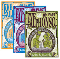
3. “We did mock-ups of three color palettes we liked. They chose green and plum. Originally Eve wanted everything in letterpress, but as we colorized the illustration of the poster, we realized we needed more depth. So we offset-printed it and letterpressed the rest of the suite. (Offset-printing is a more affordable technique than letterpress.) When you offset-print you can use every shade of the color. They chose a sturdy, uncoated paper, because they did not want a glossy finish.”
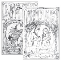
4. “We created many—ten, actually—versions of the invitation (the flipside of the poster). There are four different fonts—Euphorigenic, Bodoni, Rosecube, and Poppl-Residenz—and they are arranged in a sort of hierarchy that works seamlessly. Eve and Alphonso’s names have the fancier script (Poppl-Residenz Light), alluding to the formality of the wedding; their parents’ names are in Euphorigenic, which more noticeably keep to the Art Nouveau style. They liked the feathery, calligraphic swirl, which I got from a library of vintage calligraphic ornaments.
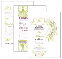
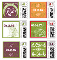
5. “The stamps were designed to match the invites. In this case, Eve wanted to introduce orange instead of repeating plum and green everywhere. At their wedding, she carried an orange bouquet, Alphonso wore an orange boutonniere, and their centerpieces were all purple plums and greens to fit the stationery color scheme.”
Photographs by Davies + Starr. Scrapbook art courtesy of Lisa Hoffman.
EVE AND ALPHONSO
September 14, The Lighthouse at Chelsea Piers, New York
Ceci New York, from $2,000 for 100; 212-989-0695
“Eve wanted the suite components to be coherent but not matchy-matchy. All of the thematic elements are visible: The rose is used throughout the collection in various colors and sizes—the bride holds one in her hand on the poster side of the invitation, its shape mimicking the tendrils in her hair. We created a rose pattern for the flap of the RSVP envelope, which is the same as the pattern on the poster, except we reversed the color. We used the calligraphy details from the RSVP card on the front of the invitation envelope, printed it on the stamps too, and included a little hint of a swirl on the back of the envelope. All in all, this took us three months (it usually takes much longer). I showed them four rounds of revisions, and I met with them three times—the rest we did through e-mail (via color PDFs).”
MEG AND WILLY
June 3, Frankies 457 Spuntino, Brooklyn, New York
Swayspace, from $1,200 for 125; 718-596-3520
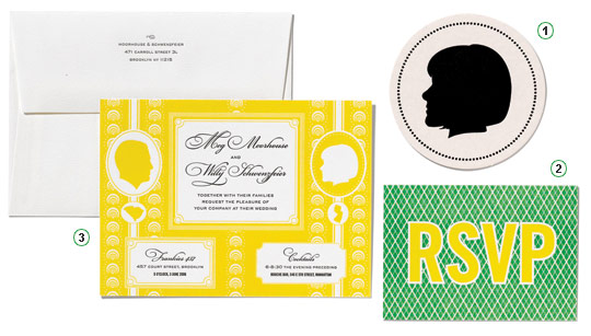
1. “Willy made me a charm of his profile as a birthday gift—which I wore around my neck. We printed our profiles on our invitations, and also on coasters as an ode to that. The coasters were appropriate because we’re cocktail fanatics. One of our ceremony readings was literally the recipe for a Manhattan.”
2.“We saved money by doing RSVP postcards (no need to buy reply envelopes). But they all came back to us in tattered shreds! The paper was a fine printmaking paper that apparently wasn’t up to the rigors of the USPS.”
3. “We have old-fashioned touristic platters of our home states, New Jersey and South Carolina, hanging in our apartment.We printed them in mini on our invitations. The yellow background was inspired by a wallpaper we liked.”
SANDRA AND MICHAEL
September 15, The Prospect Park Boathouse, Brooklyn, New York
Sesame Letterpress, from $1,200 for 100; 646-263-7916
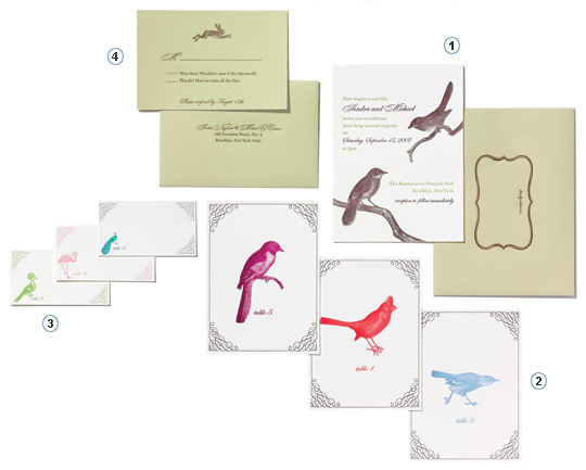
1. “We really liked that the birds had a subtle symmetry with our venue—the Boathouse in Prospect Park—which is an Audubon Center during the day.”
2. “We did pictorial table cards instead of table numbers. We considered other illustrations—Brooklyn landmarks, Coney Island rides— before deciding to do birds. Our table centerpieces were birdhouses, which guests took home.”
3. “Each table had a number and a designated bird. If you were seated at the peacock table your place card had your name in calligraphy, a little peacock, and the table number.”
4.“Store-bought, prepackaged invites were too formal for our taste, and we didn’t like that all the pieces in a suite looked uniform. So we went custom. For our RSVP cards we used wording that was more playful: ‘Woo-hoo! Wouldn’t miss it for the world’ and ‘Shucks! Have to miss all the fun.’ ”
KRISTEN AND HAIK
August 4, The Apawamis Club, Rye, New York
Cheree Berry, from $1,500 for 100; 917-532-0490
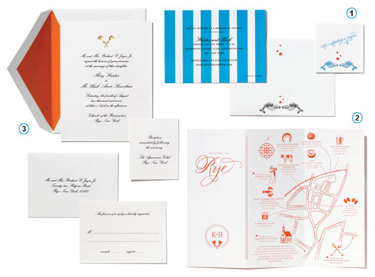
1. “While the reception’s colors were orange and gold, turquoise was the accent color for our rehearsal dinner. The invitation design matched the striped tablecloths of the beach club where we had it. We printed kissing goldfish on envelopes and place cards as a sort of seaside motif.”
2. “We wanted a map because most guests were coming from out of town. We put each in an orange canvas bag that had ORANGE YOU GLAD YOU CAME? printed on the front. We filled each bag with oranges, orange gum, and goldfish crackers.”
3. “Haik’s Dutch, so we used tulips and orange (the national color) in the design. It’s also my favorite color. I’m one of six. When my sisters wore pink, I insisted on wearing orange.”
GINA AND RYAN
July 8, Studio 450, New York
Lion in the Sun, from $500 for 100; 718-369-4006
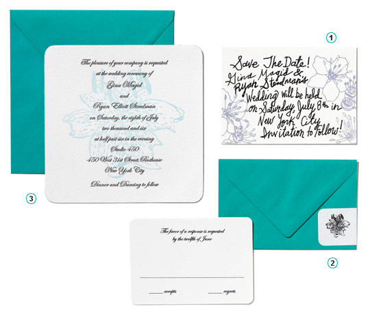
1. “For the save-the-date, I used flowers based on those in a painting for a show I was in at P.S 1. I engraved my own handwriting so it’d feel more personal.”
2. “We both love turquoise and used the color throughout the wedding reception. My bridal party chose their own dresses in any shade of blue-green. We asked the groomsmen to wear a blue-green tie or handkerchief.”
3. “Ryan often brings me lilies, so I decided to draw a spotted lily myself and have it letterpressed into the background of our invitation card. I use orchids in my work, so I considered that, but in the end I thought an orchid would be too sexual for a wedding invite.”