In 1977, as the city recovered from its bankruptcy scare and reckoned with an unprecedented surge in violent crime, the state department of commerce hired an advertising agency to come up with a slogan and logo that would promote tourism. On the way to a meeting for the campaign, the designer, Milton Glaser, sketched an idea in crayon on scrap paper: I❤️NY, stacked neatly into a square. The design was instantly adopted by the city, purchased endlessly by tourists, ripped off by counterfeiters, and invoked endlessly during New York’s darkest days.
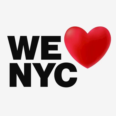
Now there’s a new logo for 2023, but the reception for this one may not be so warm. On Monday, the Partnership for New York — a group of businesses and very rich people promoting economic growth and advising policy in the city — debuted a campaign to boost civic pride post-pandemic. But what they came up with kinda sucks:
The Partnership reportedly wanted to acknowledge the original Glaser design “but push it in a different direction” by adapting the font in use on subway signs. (Which, by the way, is Helvetica, one of the best-known and most-used fonts around.) The logo’s designer told the New York Times that the group aimed to “give it more of a modern twist,” which does come through thanks to the emoji heart. But, importantly, the way the thing is centered makes it read like “WE NYC ❤️,” not “WE ❤️ NYC.” When the logo dropped on Monday morning, I showed it to my girlfriend. “Did you make that?” she asked, well aware of my lack of artistic talent. “Something’s not right. It’s off.”
The vision for the new campaign, with its goal of combating “negativity,” as CEO Kathryn Wylde put it in recent interviews, is commendable. Wylde says the Partnership wants to remind New Yorkers that “we don’t have to maintain these divisions that have grown up between business and labor and rich and poor.” But if the initiative’s heart is in the right place, the logo’s heart is not. Though we at New York may be slightly biased in favor of Milton Glaser.


