
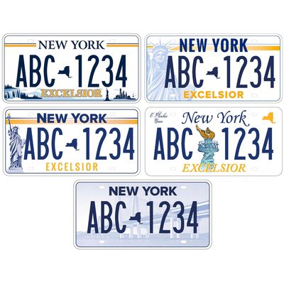
New York State is about to adopt a new license plate. Five designs were floated, online voting concluded on Labor Day, and we now await the announcement of the winner. (The Times has suggested the deck was stacked by the governor.) No matter which of the five plates the citizenry chooses, though, it’s going to be a stinker: All the designs are terrible. Last night, New York’s city editor Christopher Bonanos and design director Tom Alberty got into a Slack conversation about precisely why they’re so bad.
Tom Alberty: I’m late to this, but I just saw there was a statewide vote.
Christopher Bonanos: Yes. There are four finalists showing the Statue of Liberty and one showing the Mario M. Cuomo Bridge, and mayyyybe — per Nate Silver — the four Liberty plates will split the vote.
Tom: I mean, yes, there’s the political part of it, but what I care about is: All of these designs are terrible.
Even if the Statue of Liberty plates don’t divide the vote and give it to the bridge — very clever, Governor Cuomo! — really none stands out. It’s a question of which one is the least bad.
Look, I’m sympathetic to the designer(s) out there doing their jobs, and that the approval and selection process must be complicated. But setting that aside, other states have nice license plates, even really desirable and cool ones. California offers retro black plates. Rhode Island’s is great. Vermont’s is classic.
Chris: Delaware’s too. In California, I know, they almost fetishize the old black plates with orange letters — the originals, I mean, which you can keep using indefinitely. The orange-and-blue New York plate is a classic, and it was really nice to see the state return to that color combination a few years ago.
Tom: I say we shouldn’t change it. The current plate — Empire Gold, the DMV site calls it — is bold, simple, and classic and recalls the New York license plates of the past. I’d be fine with a new design if it were better, but …
Chris: Let’s go over these possibilities one by one because each is its own design failure.
First off, which of these do you think is the least bad?
Tom: …
Chris: Okay, noted. How about we discuss the worst?
Tom: Well, let’s pick off the easiest: the one people suspect was engineered to be the winner — the bridge.
Chris: The Mario M. Cuomo Bridge, that is.
Tom: BORING.
Chris: It’s very gray. And the uprights of the bridge compete with the tall, narrow letters.
Tom: For legibility, bad. To get design-pedantic here, plates are supposed to be readable and clearly show the state they’re from. Many vanity plates get awfully busy, and they’re just ugly. Here, it’s a little busy, and it’s boring.
Chris: I assume these have all been tested to work with E-ZPass cameras and the like already, but still — as you say, the main point of a license plate is legibility. I’d also say the secondary point of a plate with an image is to advertise the state by using its public symbols, and —
Tom: Of all the state landmarks, a bridge? This bridge? At this scale, it looks like the new Kosciuszko Bridge or the new Goethals Bridge.
Chris: Right. This is an attempt to turn the Mario M. Cuomo Bridge into a symbol, rather than evoke the ones we already have, like the Brooklyn Bridge. Which, frankly, is not going to work.
Tom: Going back to your question … I guess the least bad one for me is at the top left [see image at top of page]. It’s clean, and the state symbols are at a minimum scale. But it’s very similar to the old blue-and-white plate, and it looks a little too much like Pennsylvania’s, so … what’s the point?
Chris: It’s also pretty clearly a politicized choice: It has Niagara Falls at the left and the Manhattan skyline and Statue of Liberty at right, so it can resolve the perpetual resentment of upstate voters toward downstate voters. Good for vote getting, bad for design — because at a distance, the bottom of the plate looks like a PowerPoint bar graph to me, one where fourth-quarter sales are up.
Also, you’d know more about this than I, but who on earth thought the gold EXCELSIOR in a chunky serif font with black outlines was a good idea? It looks like My First Day With PageMaker circa 1995.
Tom: I think that honor goes to No. 4.
Chris: Four typefaces on one plate is, uh, impressive — one being Zapf Chancery, or something trying to be Zapf Chancery. Also the statue’s arm fading into the EXCELSIOR, bringing the word to the edge of unreadability, is not great.
Tom: And E PLURIBUS UNUM in wedding-invitation script.
Chris: Just floating up there, like a little cloud next to the bolt hole.
Tom: Like a whisper.
Chris: An awkward, ill-timed whisper. The creepy uncle of mottoes.
Tom: So now it’s down to a contest between Ghost Liberty and Opaque Liberty.
Chris: The O.L. reminds me of the 1980s plates with the red stripe. I never really liked those, either, but they’re pretty pulled-together compared with this.
Tom: True.
Chris: Whereas G.L. looks a little irritated at us. Something about the dark eye sockets.
Tom: She’s irritated because Trump. Ooof.
Chris: She’s an older New York woman, and she has had enough of his nonsense. “Give me your tired, your poor — and, please, can we get rid of that schmuck already?”
Tom: To get art-director nerdy again, the renderings of the Statue of Liberty are like bad clip art. The statue could be worked into a design on the plate in a more graphic or clever way.
Chris: Yeah, run the points of the crown across the top or something. I’d say the EXCELSIOR type treatment is best on the Ghost Liberty one. Agree?
Tom: Yes.
Chris: I’m not sure, but the typeface might be Gotham.
Tom: Maybe? It could also be a knockoff. I mean, they’re using a system typeface like Zapf Chancery. C’mon.
Chris: Fake Zapf, so fake Gotham would be in keeping with the jankiness of the whole thing.
So I guess I’d vote for one of the two Libertys — not sure which. Probably the Ghost Liberty one. Unenthusiastically.
Now, I have a question for you because you’re the graphic-design pro: What would you do, given the assignment? You get one central image, a very brief motto, maybe a shape for the hyphen. My own image ideas are all provincial to New York City and would not get a single vote upstate — I mean, if I got to choose, I’d put an Anthora coffee cup on it. Or a bagel.
Tom: A pigeon! But I think all the plates with imagery look clichéd, like they’re from a state tourism department.
Chris: Which, loosely speaking, they are.
Tom: True. Again, the value of “Empire Gold”: only colors, no symbol, just the small state shape. And it’s simple.
Chris: Ah, right — state colors are not regionally freighted.
Tom: If the state wanted to make money, they could make the bridge the default plate, and if you don’t like it, pay extra for a “throwback” plate — Empire Gold or the 1980s Liberty plate.
Chris: That’s the best idea of all. Options! And at least two that are not awful.
Tom: Or they could put out a call and engage some graphic-design talent in the state to give it a shot.
Chris: Hey, Milton Glaser hit the bull’s-eye for New York State once before; why not try again?
Tom: Yes, Milton, of course. And there’s Michael Bierut at Pentagram — he’s done civic design for the city (Citi Bike map kiosks, redesigning the city “No Parking” signs).
Chris: I talked to him about Times Square a while back, and his eye for the urban landscape is amazing. His first draft, done while he was sleeping, would be better than any of these designs.
Tom: Whatever the outcome of the vote, I’m ready to be disappointed.


